Market Forecasting: how to do it, consume it, make it useful, and make it repeatable
Published: December 31, 2020
How to do it
1. You want a simple model
Simplicity is important. We are talking mathematical models to predict the future. And it is very tempting when building these models to add as many explanatory variables as you can to reduce model error.
But that is the sort of mistake that you have to avoid because you end up with models that predict the past quite well, but do not predict the future very well, which is referred to as overfitting and should be avoided. Predicting the future is generally how you build these models, not to predict the past. We use as few variables as we possibly can and still get a reasonable model.

2. But it must be useful
A model must be useful. We define useful as having some ability to predict the future, not just the past. We’ll discuss how to test for that. But suffice it to say, you need to test to decide what is going to be useful going forward, not just looking at your historical data.
The simplest model in this territory is a naive model, which just means tomorrow’s price forecast is today’s price. We can assume due to lack of any other information that the price tomorrow or next week or next month is today’s price. Often, in the absence of better information, that is as good as you’re going to get. But we’ll discuss ways to get much better than that.
The more complex models, of course, are tomorrow’s price is some factor times today’s price and some other factor times port inventories and some other factor times trend, etc. These are the types of models or functional forms of models that we are talking about.
3. The world is complicated
Building models like this is fraught with risks because the world is hard to explain through models. Behavioral economists and psychologists will say we tend to impute cause and effect, often erroneously, and that we as humans tend to look for cause and effect and tie it in places where it does not actually exist. This is sort of a calling for caution in model building.

4. Models are the same
The evolutionary biologist will say that it is humans who actually ascribe cause and effect. When a lion is near you in the savanna, you had better take cover or something bad will happen. Cause and effect wariness is presumably in our genes to survive - which explains why we humans tend to look for cause and effect, because our survival could depend upon it. Models are the same. Cause and effect is what we are actually trying to illustrate in models.
Finding correlations are the start of that journey. Looking for two variables that are correlated like today’s price and tomorrow’s price, they will probably be correlated and then we ascribe causality.
5. Models are powerful
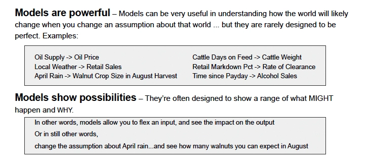
The reason that every industry has adopted analytics to some extent in the last five years is that models are powerful. They are very powerful. You can do some amazing stuff with models. There are hundreds of models out there. The oil price is one we all know about and it is not a tight relationship, but it certainly exists. Local weather and retail sales is another example. If you are predicting grocery store sales, knowing the weather is relevant to a large degree.
If you know yesterday’s sales and local weather, or for example, April rain and walnut crop size (which is a bit more random), we can pretty well tell what the size of the harvest will be in August. Cattle days on feed and cattle weight is another example - no mystery there. There is a huge amount of science that has gone into retail markdown and rate of clearance - several companies have been built around this model. And quite a phenomenon we’ve seen in the United states is the time since payday and alcohol sales.
6. Models show possibilities
Knowing an expected value tends to be what most of us think about with a predictive model. For example, what is the price going to be next month, as opposed to what is the range of prices that we can expect based on different assumptions. DecisionNext is on a sort of crusade to create a process around testing scenarios. There is a lot of stuff we do not know about next month. So let’s flex the inputs and see what could happen next month and observe the implications for price. Think of a model as more dynamic way than a machine to predict value. Using the walnut crop example, changing the amount of rainfall, making it a rainy month or dry month, we can model what will happen.
7. You must capture two things
We’re going to talk about unexpected events, and this is a little bit more technical. There are two fundamental challenges when you’re building a model: figuring out what the causal variables are, and what data do we have that might predict this thing we’re trying to predict. For example, price (to make it simple) and what is the shape of the relationship? Meaning, if I change production models, does price change a lot or just a little? Does it change linearly, or does it change exponentially? What is the shape of the relationship in question? And the more basic question: Which causes have an effect? - which is generally more difficult when you have data sparsity. This is counterintuitive to most people. But in commodity markets you actually have data sparsity.
It seems like you have tons of data because you have price changing throughout the day and you have hundreds, in some cases thousands, of potential causal variables. That seems like a lot of data. But that is not actually the case when you think about the requirement of a model to hold everything else effectively constant when it analyzes the effect of one variable on the other variable that we’re trying to predict. The chaos created by market volatility means that holding everything else constant is tough, and you need a lot more data than you would if things were stable. For that reason, this is actually a sparse data environment.
8. But which of them is more important depends on industry
One industry that I’m very familiar with, where the shape is what matters, is retail. We know pretty well what the causal variables are on the store shelf in a grocery store. There are four biggies: price, space, promotion, and assortment. This is quite obvious.
There are several other lesser variables, but these four are the main variables. Confusion here is usually around discerning the shape of the relationship. If we change the price of mustard, do we affect hotdog sales? If we change the price of hotdogs, do we affect the hotdog sales? In retail, this is a good counter example. But in commodity prices, the shape is not the same. The question is: How do you narrow down the territory of all the potential variables to something that is trackable and explainable?
9. Try to explain it
An important lesson is to always try to explain it. For example: We have a candidate data set and we’re trying to predict iron ore prices and we have hundreds of variables. We try them systematically one by one or in different groups until we find a set that works. Then we must try to explain it. Something like, it makes sense that port inventories have a strong relationship and is selected by the model, because we all know that if port inventories are high, then price is going to be low. They will be much more price sensitive and vice versa. There is an inverse relationship. That is explainable. But if we have some version of the phases of the moon in our data set and the model says, well, that is correlated to iron ore prices. As interesting as that might be, we’re going to have trouble explaining it, and we would be very skeptical about including that variable.

Notice there are two components to why this matters. One is that we have a better model, and it is a safer model because we are more sure that these are not spurious relationships. The other is that as we build organizational confidence around the model, people are more likely to believe its answers, which have their own value. A model that is not trusted is a model that is not used. It’s a waste of time.
A good illustration is, ice cream sales and shark attacks are generally correlated, but nobody thinks that ice cream sales are causing shark attacks or that shark attacks are causing ice cream sales. Perhaps you could argue the latter, but they are both proxies for temperature. And when temperature goes up, you sell ice cream and people go swimming. You have to go swimming, generally, to get attacked by a shark.
10. But if the penalty for error isn’t high, maybe just go with it
If the penalty for error is not high, explanation is less important. If we’re pricing a shipload of a bulk commodity and the price of it is measured in tens of millions of dollars, our penalty for error is high. If we make mistakes here, the penalty is very high, However, if our model is predicting what promotion we should put in front of a user on a computer screen, our penalty error is very low because it’s just one transaction among many. Going with a model that is harder to explain can be okay. But importance lies not just in the likelihood of error, but with the penalty.
11. The big opportunity is in understanding risk
If there is one lesson to emphasize above the others in modeling, it is to put more weight on risk and less weight on expected values. The idea here is that the actual predicted expected value in any forecast is pretty unlikely. It’s probably not going to happen. And if this is true, and most people would agree that it’s true, then we should be focused on the area around that expected value and the shape of it.
In a statistics textbook, you will get a beautiful Gaussian curve or a normal curve like the one on the left that describes what the errors around a forecast generally look like. This is a normal distribution. But the real world does not usually behave this way. Sometimes it does. But in general, we have asymmetric curves. The world is full of dirty data and different things happen around each side of an expected value.
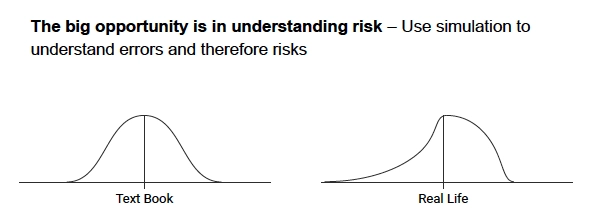
If we’re pricing a commodity for future delivery in a transaction where I am the seller, and I know that the distribution is asymmetric, I better know if it is more likely to be higher than this value in the future or lower than this value. If I’m the seller, I don’t like the distribution on the right. This means I think there’s a good chance I’m going to make a bad decision because lower is looking more likely.
12. Be wary of overconfidence
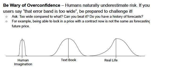
The issue of overconfidence is another lesson. We tend to imagine the curve on the left, and that the expected value is going to be that way. And sure, there is an area around it, but it is not too much. And we humans would tell you through our actions that we reply on the graph on the left. It’s important to compensate for this bias.
How to consume it
13. It’s not just about expected value
The lesson is to be prepared to challenge a forecast in our team or in our company. One thing everybody says when they see forecast error bands, is that the error bands are too high. Anybody could predict that.
That’s a pretty easy reaction to come up with. The important question to ask when we hear that is:
Compared to what? Let’s talk about our frame of reference here compared to what we forecast in the past or compared to our intuition or what else? Therefore, it’s useful to go through this exercise to make sure that we’re framing the problem correctly. Sometimes, confidence bands are quite skinny, but usually they’re wider than our intuition would have them be.
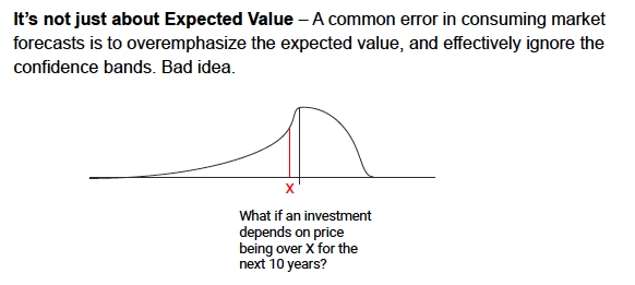
Continuing with the mining example: How would we price a project? Let’s assume a mine has a project on the drawing board, and we’re trying to decide a ‘go’ or ’no-go’ on the project. We have an expected value for the forecast of the price of the commodity under discussion for the next ten years.
If we knew that the distribution of error around the forecast was like this illustration - that there is a big fat area just to the right of the expected value (and of course we tend to talk about the black vertical line, not the red one), and the downside is a long, skinny curve. We know that depending upon risk tolerance, we may be pretty uneasy about this project because there is a lot of range on the left of the x, which is the minimum price for a profitable project.
There is a lot of range on the left and it might not look very good down the road when the price is south of x. This is an interesting example because there is plenty of real-life examples in the mining industry of projects that were approved because of groupthink around price being north of some value that seems safe today. But when we actually look at the distribution of errors, we would never have approved the project. Thus, it is not just expected value, it is the range that is important.
14. Also, Strange things happen
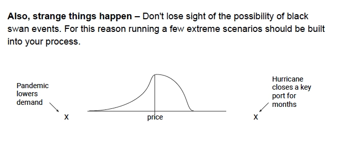
Strange things happen. This was a more difficult argument prior to 2020. But stuff does happen that completely upends a model and its ability to predict. We should not kid ourselves about this fact. The only thing we can do that is reliable and repeatable is to exercise the model. For example, let’s assume demand falls off precipitously for the commodity and the pandemic is the proximate example.
Or let’s assume that supply is cut off and demand is still there. Hurricanes or typhoons are good examples of this. Actually exercising the model and running extreme scenarios should be part of the process. Perhaps not a daily process, but at least weekly or monthly processes within your organization, actually turning the crank up with some cadence, because there may be times that you find things have actually changed.
How to make it useful
15. Translate the forecast
Another very important point is to translate the forecast. No matter how obvious a price forecast or a sales forecast or a volume forecast is for the next time period, translating it into its implications, into what you should do as a result, is very good discipline. The reason is that human behavior, behavioral economics, show that when a forecast agrees with a user’s intuition, it’s very plausible.
If a forecast is kind of what the user thought would happen, they will likely execute. They will do the logical thing that is implied by the forecast. But it’s a very different story when the model doesn’t agree with the user’s intuition. When the forecast is counterintuitive, it’s very easy for us because of something called confirmation bias. We tend to be biased towards agreeing with things that confirm our preconceptions, and to ignore things that do not. However, the one really interesting fact is if you do the translation, no matter how obvious it is, it’s much harder to ignore.
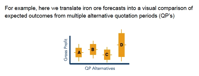
For example, If we have four different alternatives for a load of some bulk commodity, there are four different QP alternatives. They have different expected values, represented by the horizontal line in the middle of these four points. The vertical line is the range, risk or distribution of possible outcomes. If we are seeking risk, we might go with option D where we have a higher gross profit. There is certainly as much risk there as anywhere else, but we get a higher gross profit. However, if we are more risk averse, we would likely go with option B, a higher expected value and lower risk. Perhaps one or two of these were not obvious from the forecast. We could just go with the higher gross profit, which is D. But plotting them out next to each other and figuring out that B is the one we probably want to do has huge value. In summary, translate the forecast, don’t skip this step.
16. Scenarios are very important
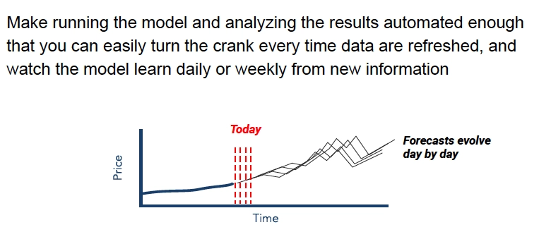
Scenarios are important and we should be running scenarios as a matter of course, as part of a business process. Every day, as we turn the crank and we gather new data, a new row of data in every data set, or every daily data set comes in, the model might say something different. Let’s turn the crank again and look at the model again. This is useful in and of itself. However, there is a second thing that happens, which is that it builds a more intuitive market understanding. And the team that is using it, in terms of team development, by turning the crank on a model every day or at least on a cadence, maybe weekly, has value.

Here’s an interesting example of scenarios that is relevant now, but would not have been relevant a year ago. Everyone wants to know what the recovery from the pandemic will look like, country by country. With this U.S. example, there is a baseline forecast, a mild recovery scenario, a rapid recovery scenario, etc. Each of these scenarios will actually change a commodity price forecast, some by a lot and others by a little. This is remarkable, by the way, because a year ago this would not have been true. Macroeconomics have become micro. In other words, month to month we have big macroeconomic changes in the industrialized countries. Whereas in the past, you would not get big month to month changes. We are at a point now where macro has actually become micro.
Given this fact, the scenarios that we’re running are often about the economy. What does an economy’s recovery curve look like? Because this will drive commodity prices. The bottom line is scenarios matter. Have the discipline to run them as a part of the process.
17. Other stuff matters too
The coal industry cares about direction, but they don’t care as much about the magnitude of the move. It turns out you can build very good and useful commodity prediction models where it’s just a sign that people are interested in. Is it going to go up or is it going to go down? Again, this is all probabilistic. You will be wrong sometimes, but you can get some pretty good accuracy levels if direction is all you care about.

The food industry cares about the magnitude of change in the forecast, rather than the actual value. Here, the day-to-day amount of change is of interest, because there is usually information in a big change, and that will sort of spark an investigation into what just happened.
There is also the correlation among data series. Lots of these are going to be intuitive, but occasionally there are correlations that are counterintuitive and understanding why can be of value.
18. Back test and back test again
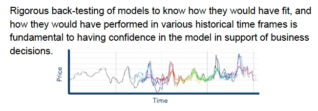
Back testing is really important, and it is not much fun. With back testing, we build a model and then actually deprive the model of data beyond some historical date and test it on the data before that date to see how it would have predicted the future beyond that date. The purest and most rigorous is to actually build the model with the data before that historical date.
We aren’t benefiting the model with the future in building the model, much less actually running it. In any case, whether we take the most rigorous or the least rigorous back testing, the model matters because we can get beautiful models that explain history quite well that are useless in the future. And until we actually do the back testing, they’re a waste of time, because we don’t know how they’re going to perform in future.
If you want a scalable, repeatable process in your company and use models to predict something, you must put back testing into the process. Back testing will probably be resisted in general because it’s a lot of work to set up. But it’s worth the effort. Not only do you get models that are better, but you have more confidence in the models among the team and communicating to a team that you have dependable models has its own value.
This is an interesting picture. Aside from being beautiful (especially to data analysts), the ‘what’ is happening here in the different colors. This is a price data series. The black line heading from the left to the right over time is a price data series. But then you see different colors start to emerge on the line. This is what a rigorous back test can look like.
A fourth of the way, just past the first vertical line, a blue forecast starts to appear which is quite different than the black line and they deviate significantly. This is a back test. Where the blue forecast first appears is the cutoff point for historical data. We train the model only with data to the left of that point. And then we forecast the data series, which is the blue line, and there is quite a bit of error there. Then we fast forward - usually by a month, or a quarter, or perhaps a week - and we use that additional data to further train the model. And then we run that forecast. And we continue incrementally forward through time, adding more data and doing new forecasts which are represented here as the different colors.
No forecast is perfect and they never get a perfect adherence to real life. But they get much closer over time. We are watching a model learning over time. And this is how we build confidence in a model with a team making decisions.
19. Automation is important
The importance of automation is the idea that there should be a process of running forecasts, as opposed to running a forecast just when you need it. This is especially true when complexity increases with different dimensions. This can happen with price volatility. Or if we’re doing many forecasts such as many regions, many items, many commodities. Suffice it to say, the more complex the forecasting challenge, the more automation makes sense, because a human’s capacity to keep track of where we need to forecast diminishes as a function of complexity.
Another important argument in support of automating is insulating the organization from the departure of the person who understands the forecast. By the way, automation might just mean using a spreadsheet every day, but insisting it gets used every day. This risk looms large for some people. But it is quite true that if you have an analytics department of one or two, then there is some risk.
Automation is also important for the benefit of organizational learning. Running every day allows people to understand what the dynamic in the market, that we’re selling into, really is.


